|
Like many organizations this summer, the Guild of Natural Science Illustration held their annual conference virtually this past weekend. While we all wished we could have been together, being virtual means a lot more people can participate in the event and also view the beautiful and varied artwork in this year's exhibit online. I am fortunate to have one of my pieces selected for the juried exhibit. Check out the link to see all of the wonderful scientific illustration: 2020 GNSI MEMBER EXHIBITION
1 Comment
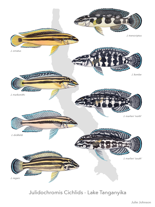
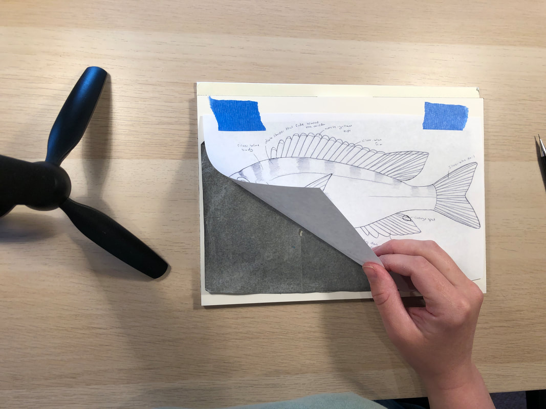
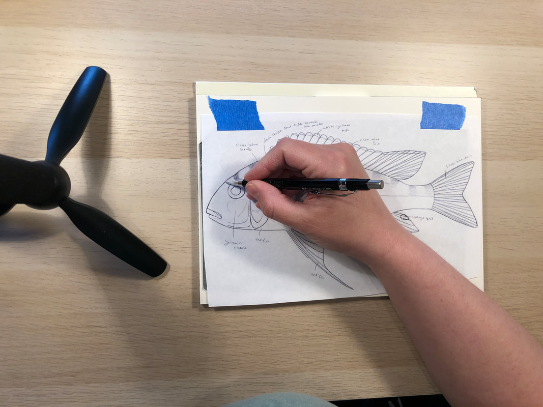
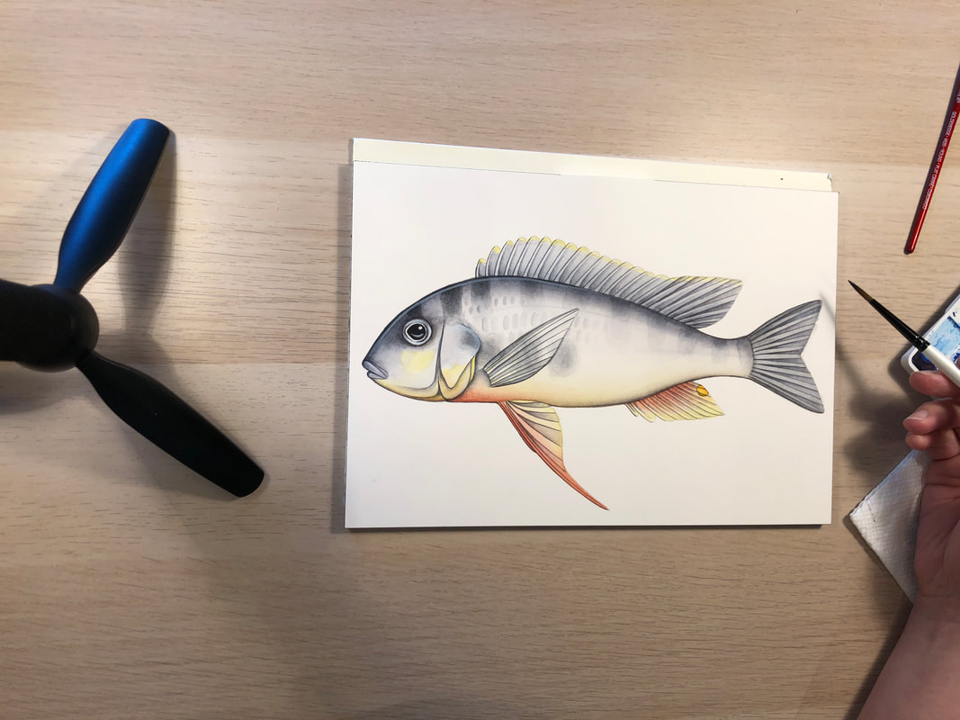
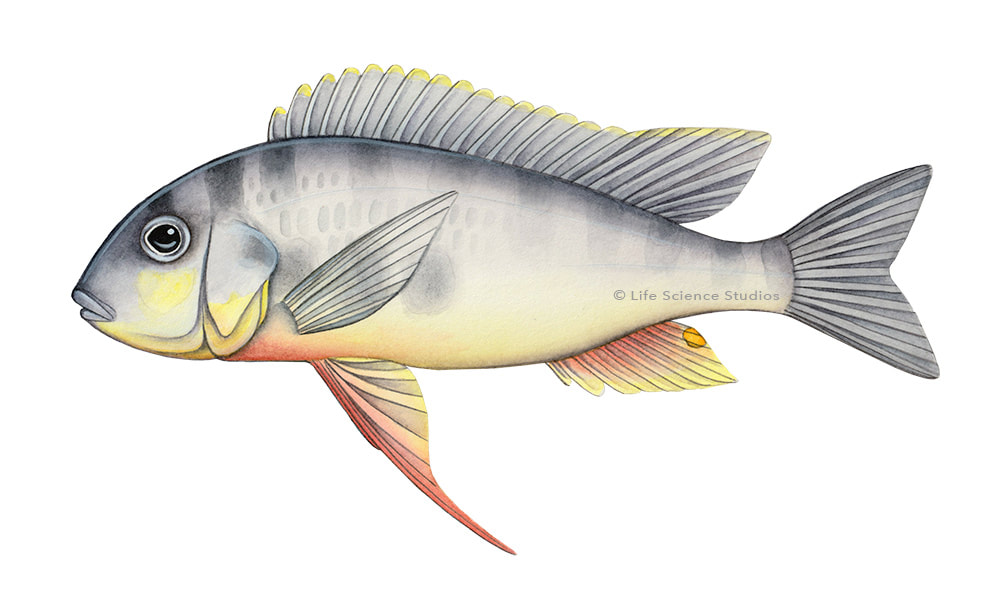
For the last few years, I have been painting all 250+ cichlid fish species in Lake Tanganyika for Walter Salzburger's lab in Switzerland. Through this project, I've learned a few things about how to paint fish, and I thought I would share my process! Step 1: Transfer the sketchI use reference photos, specimens, and feedback from working closely with experts to create the sketch. Once the sketch is finished, I then have to transfer it onto watercolor paper. For this step, I tape the sketch on the watercolor block, place a piece of carbon paper underneath, and trace the lines. The pressure from the pencil causes the carbon to deposit onto the watercolor paper. Step 2: Trace back over the sketchThe carbon sketch ends up being kind of fuzzy and smudgy, so the next step is to use a kneaded eraser to remove some of the carbon so that there is just a light shadow of all of the lines. Then I go back over all of the lines with a very light pencil. Note: most of these videos will be time-lapse. I don't actually work this fast! Wouldn't it be awesome if I did. Step 3: Fill in the base colors and shadingNow I can start painting! I add all of the base colors and shading on the body and fins. I like to use a combination of grays and purples to add shadows to the body and give it a three-dimensional shape. (I also paint the eye pretty early in the process because adding an eye makes the fish look more alive, and for whatever reason, I find it easier to paint the fish when it looks like it has some personality.) STep 4: Paint the linesNext, I use a small brush to add the lines that make up all of the fins. I always leave the pectoral fin for one of the last steps because any additional painting I do on the body would smear or fade the pectoral fin. Step 5: Shade the FinsI now use some darker grays and purples to add shading to the fins and body. This is the step that really brings definition to each of the rays and makes the fins look more realistic. Step 6: Add in the stripes and spotsStripes and spots can be tricky. In some species of cichlid, the stripes are very well defined and will have a clean edge. For those, I can just put some paint on my brush and paint the stripes. But other cichlids, like this one, have more subtle markings that don't have a strong edge. For these, I put down a layer of water first, and then add paint on top. The water layer allows the paint to diffuse and give a more faded effect. Step 7: Put in a few HighlightsAfter I've painted the stripes, I add the lines to the pectoral fin (oops I forgot to video that part). The next thing to do is add highlights. This is my favorite part. I use white gouache, which is an opaque water-based paint, to add some shiny areas. This really brings the painting to light and makes it look polished and complete. Step 8: Finishing touchesI'm almost done! The very last thing to do to this painting is add in a few scales. These paintings are going to be reproduced pretty small in publications, and adding every single scale would result in a much more complicated painting that would look messier. So I have chosen to paint most of these fish with a hint of scales by adding some darker or lighter patches. I then scan and edit the painting digitally and submit them to be used in publications and presentations!
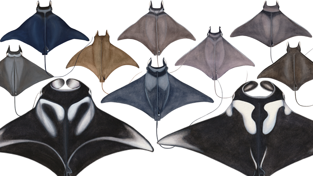
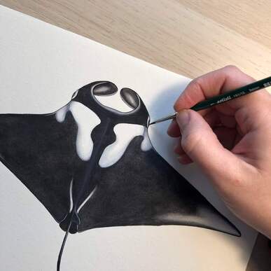
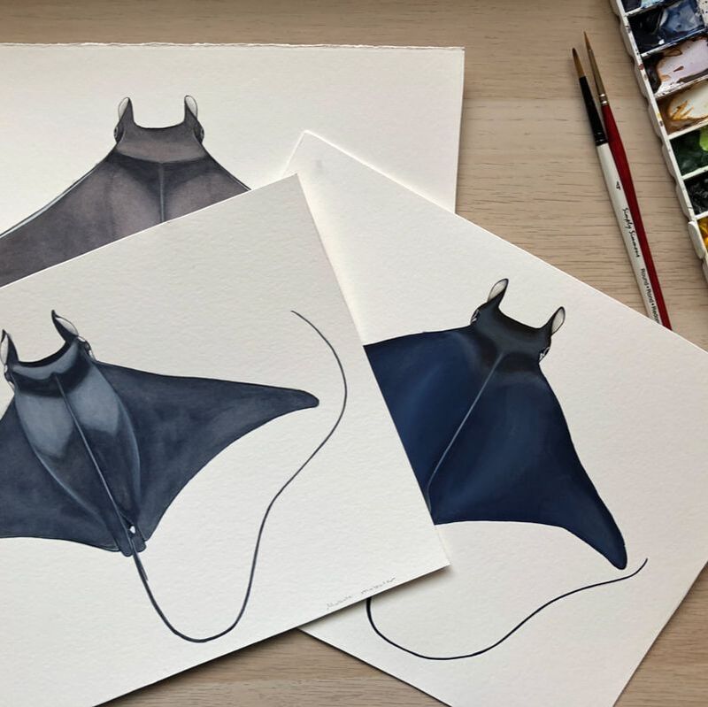
How do you communicate your research when photos of your study species are impossible to obtain or contain sensitive material? An illustrator can help create beautiful objective imagery when photos can't be used. This scenario happened with Ph.D. candidate, Melissa Cronin at UC Santa Cruz. Melissa works with manta and devil rays, and her work focuses on understanding the life history of these giant animals and working with the tuna industry to reduce the impact of by-catch on manta mortality. She needed visuals to use for communicating her research that would also serve to help with species identification. The first problem: these are massive animals. Manta rays can get to be 23 feet across and 6,600 lbs! Many of the mobulid ray species live in pelagic offshore habitats where they aren't often seen by humans, so photographing something this huge, underwater, in the open ocean, is simply impossible for her to do. The second problem: many of the photos of these rays are from by-catch. The animals are in distress and the photos cause viewers to bring in an emotional response that distracts from focusing on the details of the research findings. The Solution: Work with a science illustrator! Melissa and I talked about what she needed, and she sent me photos, videos, pages from guidebooks, and resources I would need to make her paintings. I then created these ten watercolor and gouache paintings for her. Now, she has illustrations she can use in her talks and to help with species identification and research. The artwork is clearer and more objective than the available photos. I hope my illustrations help her achieve her research goals and help conservation efforts for these magnificent animals. To learn more about Melissa's work, check out https://ccal.ucsc.edu/melissa-cronin/
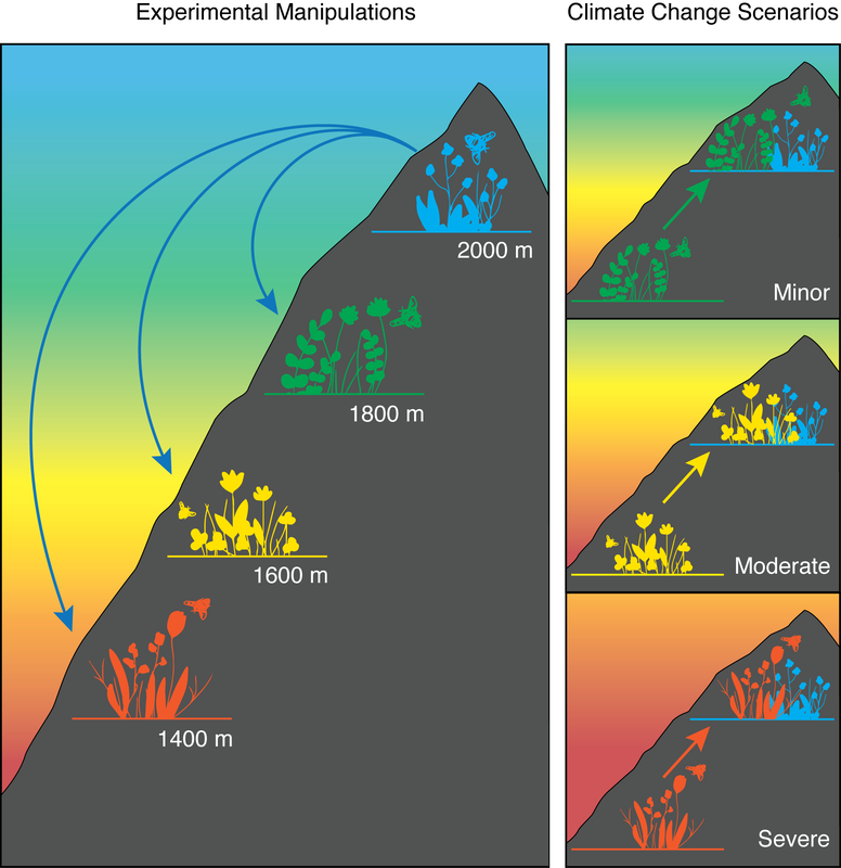
I share a home office with an ecologist. My husband is a research associate at Princeton University, and his home desk is right next to mine. This means that I often look over my shoulder and end up saying "are you publishing your figure like that? What does it even mean? Hold on, let me see what I can do." This happened the other day as he and his collaborators were finishing up a really exciting experiment they had recently completed in the Swiss Alps. This experiment involved moving entire plant communities down mountains in order to see how the plant-pollinator interactions would change under climate change. As the world warms, alpine plants would experience warmer temperatures. Moving the plants down the mountain is a super clever way of warming them and simulating climate change. The challenge was to create a figure that showed communities moving downslope and the different climate change scenarios faced by alpine plants. Here is the first version of the figure: This figure shows plants being transplanted downslope, where they will experience warmer temperatures. And then migrating upslope to escape hot temperatures as the climate warms from minor to moderate to extreme. As he explained the figure to me, it was clear that there were some things I didn't understand and that didn't make sense to me from what the figure showed. It is always a good idea to get fresh eyes on a figure because often the scientist is so familiar with the work that they become too close to the project and can't see what it looks like to someone reading this for the first time. Here is what I came up with: This figure now shows the mountain slope and different plant communities with pollinators, to give the reader context. The colors more accurately represent a conventional heat gradient and match the colors of each plant community. By creating the big panel on the left, showing the Experimental Manipulation, it gives context to the smaller panels on the right, showing Climate Change Scenarios. As the climate warms, those warmer zone communities will be forced to move up the mountain to escape the heat and will interact with colder zone communities. Showing the communities overlapping helps the reader understand the novel environment in which these species will exist.
This new illustration was added to the final paper, which just was published this week in Global Change Biology. This type of work is where science illustrators can make a big difference for scientists. By sitting down with an artist, the scientist can communicate the main message and the most important aspects of a figure, allowing the artist to bring a visual language to the figure and communicate the science more effectively to the reader. This is especially important for very complicated experiments or concepts where the diagrams are often a more effective form of communication than writing. So when your schematic looks erratic, enigmatic, or problematic, consider hiring an illustrator who can make it more dramatic, diagrammatic, and even polychromatic. Check out the really cool and important work done by these scientists. Their paper is: Asynchronous range shifts drive alpine plant-pollinator interactions and reduce plant fitness by Sarah K. Richman, Jonathan M. Levine, Laura Stefan, and Christopher A. Johnson in Global Change Biology. |
Categories
All
|
Proudly powered by Weebly


 RSS Feed