|
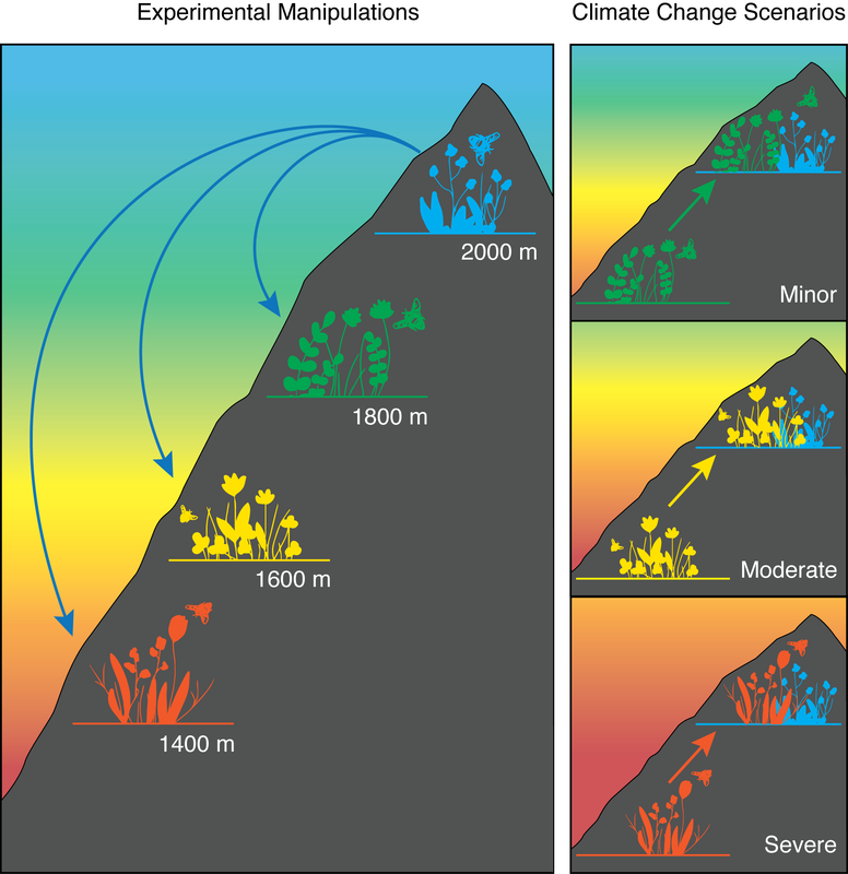
I share a home office with an ecologist. My husband is a research associate at Princeton University, and his home desk is right next to mine. This means that I often look over my shoulder and end up saying "are you publishing your figure like that? What does it even mean? Hold on, let me see what I can do." This happened the other day as he and his collaborators were finishing up a really exciting experiment they had recently completed in the Swiss Alps. This experiment involved moving entire plant communities down mountains in order to see how the plant-pollinator interactions would change under climate change. As the world warms, alpine plants would experience warmer temperatures. Moving the plants down the mountain is a super clever way of warming them and simulating climate change. The challenge was to create a figure that showed communities moving downslope and the different climate change scenarios faced by alpine plants. Here is the first version of the figure: This figure shows plants being transplanted downslope, where they will experience warmer temperatures. And then migrating upslope to escape hot temperatures as the climate warms from minor to moderate to extreme. As he explained the figure to me, it was clear that there were some things I didn't understand and that didn't make sense to me from what the figure showed. It is always a good idea to get fresh eyes on a figure because often the scientist is so familiar with the work that they become too close to the project and can't see what it looks like to someone reading this for the first time. Here is what I came up with: This figure now shows the mountain slope and different plant communities with pollinators, to give the reader context. The colors more accurately represent a conventional heat gradient and match the colors of each plant community. By creating the big panel on the left, showing the Experimental Manipulation, it gives context to the smaller panels on the right, showing Climate Change Scenarios. As the climate warms, those warmer zone communities will be forced to move up the mountain to escape the heat and will interact with colder zone communities. Showing the communities overlapping helps the reader understand the novel environment in which these species will exist.
This new illustration was added to the final paper, which just was published this week in Global Change Biology. This type of work is where science illustrators can make a big difference for scientists. By sitting down with an artist, the scientist can communicate the main message and the most important aspects of a figure, allowing the artist to bring a visual language to the figure and communicate the science more effectively to the reader. This is especially important for very complicated experiments or concepts where the diagrams are often a more effective form of communication than writing. So when your schematic looks erratic, enigmatic, or problematic, consider hiring an illustrator who can make it more dramatic, diagrammatic, and even polychromatic. Check out the really cool and important work done by these scientists. Their paper is: Asynchronous range shifts drive alpine plant-pollinator interactions and reduce plant fitness by Sarah K. Richman, Jonathan M. Levine, Laura Stefan, and Christopher A. Johnson in Global Change Biology.
2 Comments
Ethan
2/20/2020 02:15:06 pm
That's awesome! I manage invasive species and finding good educational graphics is always a challenge!
Reply
Julie
2/20/2020 02:50:36 pm
Oh wow! Yeah these community interactions can get pretty complicated to show in a simple figure.
Reply
Your comment will be posted after it is approved.
Leave a Reply. |
Categories
All
|
Proudly powered by Weebly


 RSS Feed